NGA
Bringing a brand into the modern era, being playful, clear and informative.
Client
NGA
Location
United Kingdom
Stage
Active Company
Services
Brand Design
UI / UX Design
Web Design
Brand Guidelines
The National Governance Association is an independent, not-for-profit charity, which aims to improve the educational standards and wellbeing of young people by increasing the effectiveness of governing boards, and promoting high standards. They are the membership organisation for governors and trustees of state schools.
NGA’s website was outdated. Finding information across the site was disjointed, with multiple navigations confusing the user journey. The site lacked a cohesive visual identity, which detracted from it’s potential impact and usability.
The Vision
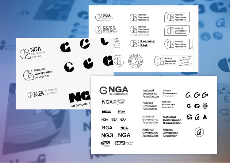
The first thing the became clear was the need for a fresh brand for the client. This approach allowed for a deep dive investigation into everything that worked and didn’t work currently for the brand. The result, NGA didn’t have any brand cohesion or any real elements that made them stand out from the crowd.
The process also involved talking to the board members of the NGA to gauge what they thought the overall message of what they wanted to convey was, Ultimately Shaping stronger governance’. The brand identity directly references NGA’s role in shaping the practice and culture of trust and school governance. By embedding the visual idea of blocks and shapes from the logo upwards the design language can take on a modern and confident graphical tone that can be both playful and sophisticated
The outcome
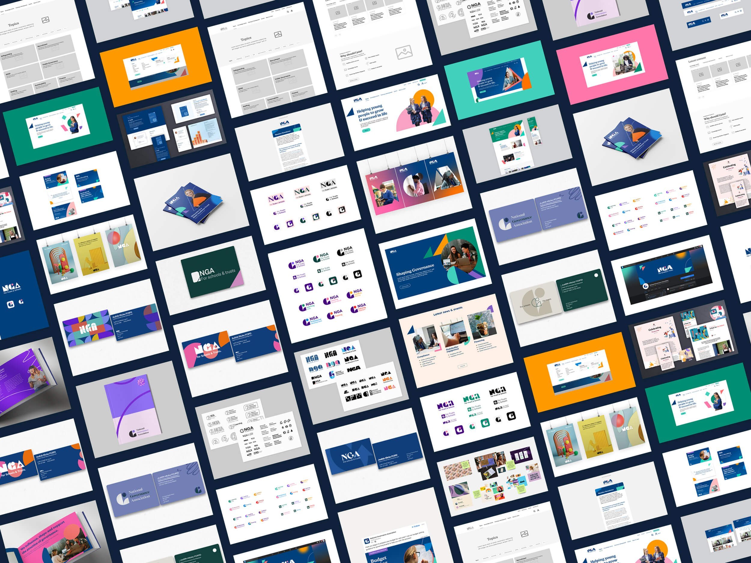
To make NGA’s site more modern and accessible, I with the team created a warm and playful brand identity. Looking forward, we in-built functionality to allow them to self-build coherent content through the use of templates. In addition, the navigation system was restructured and streamlined the filters within, so information on NGA’s training offering was easier to find.


